If you've been in the PC game for a quite a while, you'll remember many great moments courtesy of Microsoft. But do you remember Microsoft Bob? It was back in March 1995. Windows 3.1 was running on most PCs and making it difficult for computer beginners to feel at home with their machines. User interfaces were visually barren and icons too abstract. That's when Melinda Gates, wife of Bill Gates, weighed in on project Bob and took on the role of product manager. Maybe the couple were already contemplating a bigger safe in the Gates mansion in view of the anticipated profits but things didn't turn out quite as they had hoped. Let's take a trip down memory lane to a time when great expectations weren't met, yellow dogs were roaming the virtual worlds and computers were turning into haunted mansions.

Windows 3.1 was a lot of things, beautiful is not one of them. There was no start bar, file management was atrocious and crashes were rather the rule than the exception. Still, the system sold extremely well, with millions of disks going over the counter. And yet, Microsoft noticed the frustration of its users and their wish for a more intuitive and user-friendly interface. That's how Bob, the vision of an interface with familiar objects, like pen and paper to launch the word processor (skeuomorphism), was born.
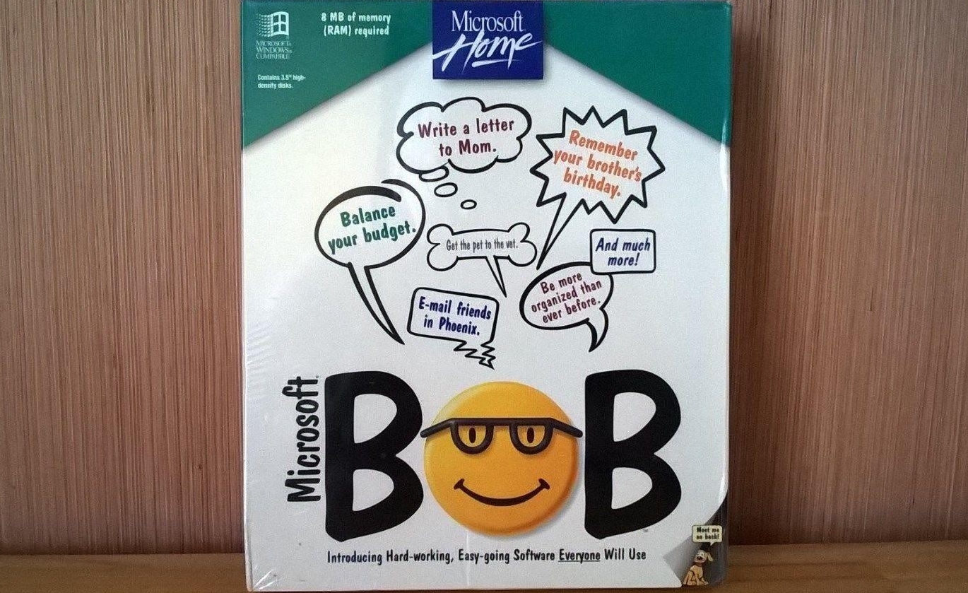
Besides Melinda Gates, the project also attracted two high-caliber professors from Stanford University that sought to make Bob more intuitive and approachable. Things ultimately took a strange turn. The logo alone, a smiley face with bulky glasses, was rather odd and not too likeable. The same goes for the system requirements: A 486 processor plus 8 MB of RAM was a steep hurdle back then and not everyone was willing to pay $100 for additional software.
So what was the overall objective? Bob was supposed to supersede the Windows 3.1 desktop. Instead of clicking through bare-bones menus, Bob was designed to provide the cozy atmosphere of a living room – along with access to all essential applications. Microsoft was so convinced the project would be a big hit that they were already planning additional software to run on top of Bob. But when Bob was finally released, it was universally panned. A common critique was that, with Bob, users would be straying too far from traditional usability concepts and would therefore always be dependent on Bob to operate a PC. Others acknowledged the new usability approach but not its actual implementation! In initial tests, the software frequently crashed destroying user files in the process. So what did Bob look like to customers?
 Many hours of joyful reading
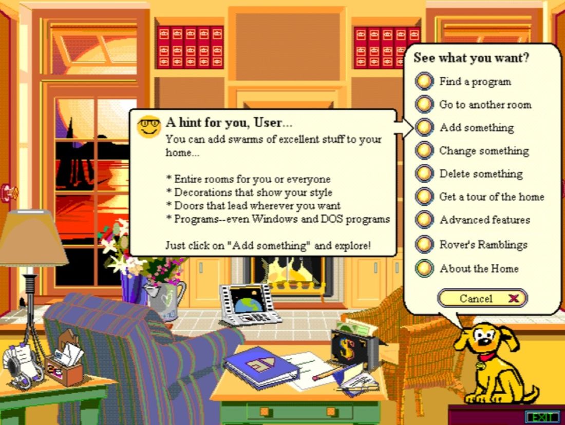
The first visit to the virtual living room already took a bit of getting used to. A yellow and obnoxiously chatty dog, Rover Retriever, continually cross-examined its users asking for all sorts of personal information that would then be used for letters, address books etc. As soon as users entered "Rover's" room, aka the Bob desktop, the critter would generously offer a tour. Those unfortunate enough to click "Yes" would immediately regret their action! Instead of a nice interactive tutorial, they were presented with text box upon text box upon text box, all filled with drab monologue. Worst of all, Rover had friends! They included "the oddly charming sometimes brash" Blythe, a feisty firefly, the "experienced observer" Baudelaire, a winged dog-like creature, the "excitable" Java, a coffee slurping dinosaur, and, my favorite, "Invisible", a "character who isn't there" and whose (winning) traits included "unhelpful, silent, no personality and built to stay that way". It really was as disconcerting as it sounds, believe you me!
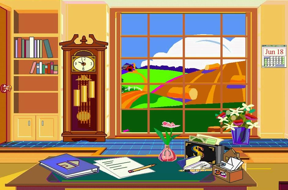
In the spirit of the times, and because storage space and resolutions were lacking, Bob's living room boasted cartoonish visuals seen from behind a desk. Features like the scheduler, word processor and others were hidden behind a clickable calendar, a batch of letters and other common real-life objects. Bob came with a lot of applications not available in Windows 3.1, like a finance application, a household manager and a geography quiz. Although, by today's standards, the term application may be not a fitting description as these programs mostly included a minimal feature set and vaguely resembled the first edition of MS Excel. And those bold souls who dared to use Bob productively all too quickly became familiar with two other characteristics of Bob: error messages and bluescreens!
Dubbed "crash generator" by cynics, Bob hadn't undergone extensive testing so the next crash was never far away. And when the system crashed, users would have to reinstall the software in most cases! I can't even begin to imagine how much cursing and screaming MS Bob has provoked since its inception. The integrated email client depended on a particular provider and would refuse to work otherwise. Terrific. On a positive note, the word processor was actually usable and demonstrated many features like templates, wizards and bulk letter, in rudimentary form, that would later be found in MS Word. Alas, the same cannot be said for the address book that tormented users with "Lexi", an assistant that would spout off all the bells and whistles of the application on an epic scale – even though the feature set was immediately obvious to anyone with an IQ above room temperature. Naturally, Clippy, pardon me, Lexi also tried to "help" writers with a myriad of suggestions, 20% of which were moderately useful.
 A program for kids with a knack for finances
Aside from the various issues, the program was fairly inconsistent. Who was the target audience? With the various assistants, program handling was strangely targeted towards kids, but what do kids need a finance application and household manager for? Adults, on the other hand, were unwilling to have obese critters explain their computers to them, which, to this day, I can perfectly understand. To make matters more confusing, various objects were just decorative and served no real purpose, giving users "Where's Waldo?" vibes. The lava lamp gained particular notoriety. Practically begging to be clicked, it did nothing more than tell curious users it was just a decorative element. Shame. At least, you could move program shortcuts for newly installed applications to the living room - until they went up in smoke with the next program crash and subsequent reinstallation.
Sales figures for MS Bob were abysmal and the software was the go-to target for ridicule in numerous computer magazines. Buyers were reluctant and the expensively produced software was doomed to be a shelf warmer. When Windows 95 came out shortly after, even Microsoft had to concede that Bob's days were over. Windows users flocked to the new system that had a consistent look and feel, the need for Bob, if there ever was any, was gone. In total, Microsoft sold roughly 30,000 copies of Bob, an almost epic failure for the company.
In case the yellow dog looks familiar: meet Bob's legacy! Rover made it into Windows XP's search function and, of course, Clippy (the former pest in MS Word) was inspired by Bob. And then there is Comic Sans, probably the most contentious font of all time and as popular as a ruptured appendix on Christmas eve among designers. While the font, designed to symbolize Rover's friendly nature, never made it into Bob, it is still part of MS Word and has become a symbol of the lack of taste often associated with some Microsoft designers.
What I would like to know: Have you ever used MS Bob? Would you like to read more about other software flops throughout history?


Oh, Bob. I found people (users) to be confused by it. Intimidated I guess. So many asked me "What do I do with it"? Then, you have it crashing & all of the other bad stuff. People wanted & needed that extra help, they just couldn't get it.
How is it Bonzai Buddy (Purple gorilla virus) was so popular? It gave clues on what to do & was animated. It was helpful.
Thanks for a nice walk down memory lane with this post. Let me sip some coffee as I look over my computer desk &. . .do I click here?
No Worse Than Cortana!
Still, Great Blog!
Ashampoo sell great products at good prices1
It's all history, but a journey always starts with a first step! Development requires many trials and errors, but if we strive we will eventually win.
Thank goodness that Bill Gates was not put off by failures.
Thanks for your work Sven. I remember the almost blank screen and having to swap out 5:25 inch floppy disks to load OS and programmes. I guess the GUI and what came with it, is the biggest change. The Cloud for distributed processing may eventually be of more significant. At the moment my internet connection is only just reliable enough. So I occasionally get short periods of time when software from some software vendors does not work, but that's not often.
Bob was the unwanted house guest who would not leave.
Clippy was like Cthreepio; charming and trying to help, but constantly intruding.
I started with DOS 2.0, Never liked Widows 3.1. I still think XP may have been their best operating system but am currently using Windows 7. I like to give Microsoft's customers time to debug their unfinished software before trying it
haha. Very good. Yes I used all versions of Microsoft right from its 'Dos' days when I was forced to use the 'command' function, and put in and take out 'disks from the disk drive :-) I had an old Zenith, Miracle and even an Apple.1. computer and I waited with apprehension for every new Microsoft release. It was so frustrating to sit here and watch a 'blue screen' crash taking place before my eyes. CPM was my first O/S then Windows 1, 3.1 and 95 and so on. Thank goodness for Windows.7. :-)
I actually had a copy of it. But fortunately was comfortable with 3.1 so got it more from a curiosity point than actually using it . Wish I still had it today. I do still have a copy with manuals of the original windows on 5 1/4 disks
Hello and thanks . For many years, I've been very familiar with the software, and I have become familiar with the software, and in the meantime, I've been the biggest developer of all of my software. It's a great job for you, executives, and the people of this great community. And in the whole world, you have the best friends. Thank you very much. You are
I must admit to never having used BoB - but I do still remember a meeting (at work) of about ten people (memory's a little hazy). Seven said "We don't want Bob" and three said "What's Bob". What I don't remember is how seven of us knew enough about BoB to reject it so firmly...
Oh yes, do keep up the good work and, yes, dig up some more of the many flops - nostalgia rules OK!
Keith
I remember Clippy. He used to tap on the glass to get your attention. I kind of liked Clippy and used him often. But all that stuff is long gone and not missed.
Hi Sven,
A great insight into the past failure of Microsoft Bob.
It has to be said though, the Internet, computers and where Microsoft is today were great inventions and in the past, especially in Britain, Germany, and all other countries in Europe had huge initial failures with the vast majority of inventions.
If we look around at present we are using hundreds of products which, thankfully the inventor of such persevered, and like Archimedes probably shouted, "Eureka" when the end result was positive.
In the case of Microsoft Bob, maybe Bill said to his wife, "You will never yell Eureka over your idea."
I remember MS Bob, Clippy and Rover, and did you use Karen Kenworthy's Peedy the joke-telling parrot, and the Wizard.
More articles on software flops is a great idea Sven, I will look forward to it.
Good.
Bob was the biggest flop for windows ever except for the first release of Vista.
Sven you covered it very well and brought back memories of those bygone times with a few chuckles.
Sorry to see the end of Windows 7 Pro which I still consider the best operating program we have had, I still use it on one of my computers for some tasks that later ones fail to do.
Keep up the good work.
Best regards, Glenn.